Intro to Microinteractions Reading
In short, treat every piece of functionality—the entire product—as a set of microinteractions. The beauty of designing products this way is that it mirrors the smaller, more agile way of working that many companies are embracing. Of course, the pitfall is that you can get lost in the microinteractions and not see the big picture, that all the details won’t fit together into a coherent whole when you’re finished. And working this way takes extra time and effort.
I find this interesting because it defines designing microinteractions as a balance between treating every feature/functionality or the entire application as a set of microinteractions but also having the ability to step back far enough to see the bigger picture. How each of the micointeractions come together and work as a whole. Treating the functionality of an application as a set of microinteractions allows designers to break down an application into smaller chunks making changes/improvements more manageable and faster to implement, however, the pitfall of this concept is that if not careful, the microinteractions will not come together cohesively. In turn making the application feel clunky, unintuitive, and unappealing.
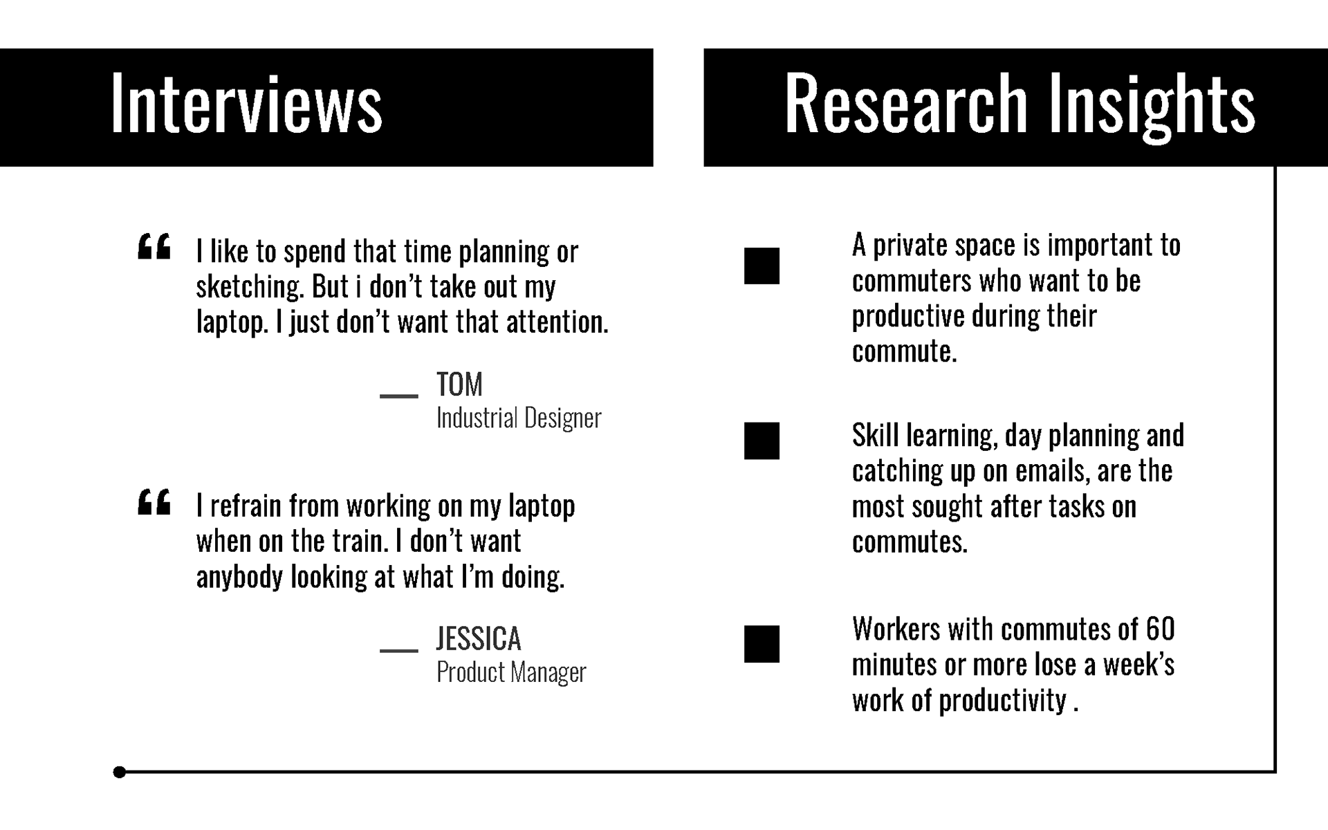
“Having quickly graspable bits of information made the transaction much faster than trying to save screens in the steps of the process.”
This quote highlights the importance of giving the user just the right amount of information to guide them through a process. Presenting not enough information makes the user unsure of what the outcome will be causing them to abandon the transaction. Giving the user too much information increases the users cognitive load which can be overwhelming also causing the user to abandon the transaction. The users needs to feel confident about what they are being asked to do and what the outcome of that ask will be.
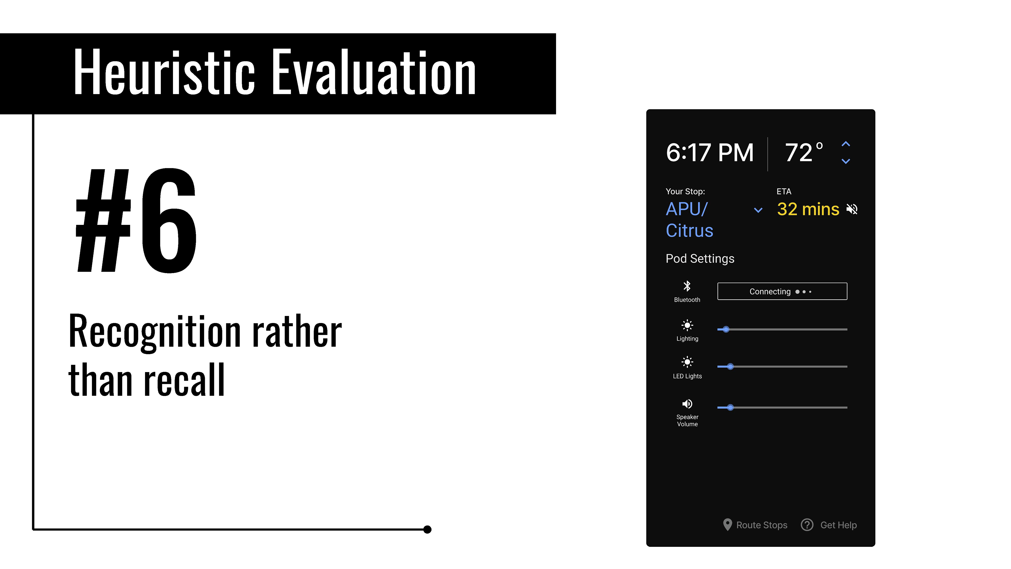
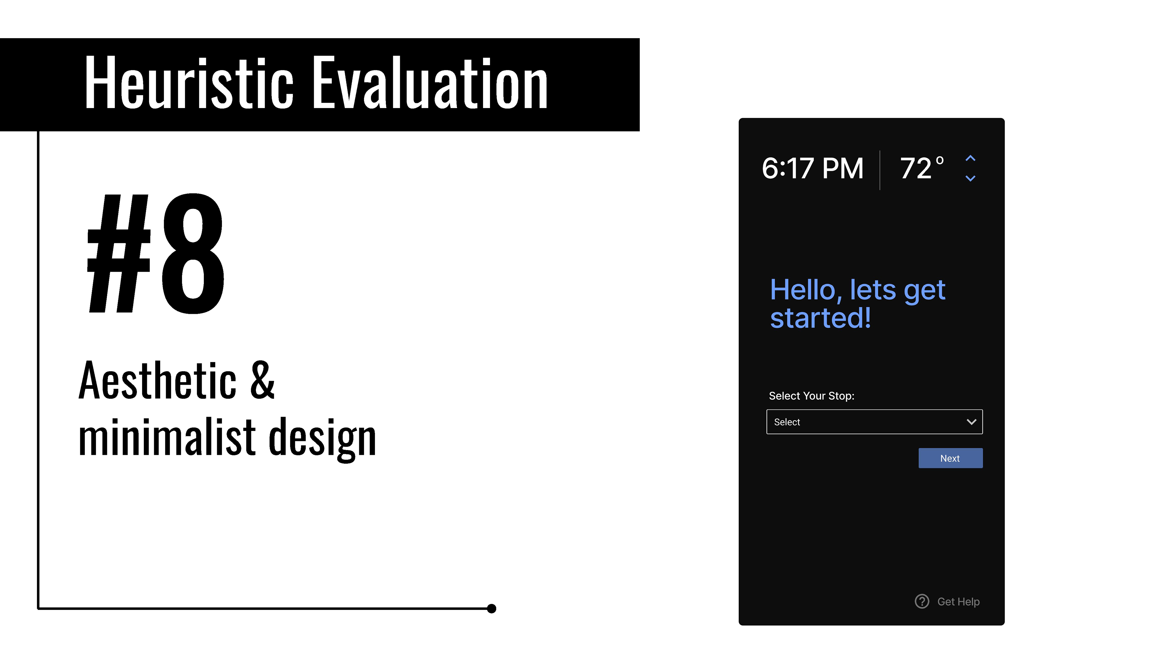
The goal for microinteractions is to minimize choice and instead provide a smart default and a very limited number of choices. The control you select for the trigger should reflect this philosophy.With microinteractions, the least amount of cognitive effort is the goal. Don’t make users guess how a trigger works. Use standard controls as much as possible. As Charles Eames said, “Innovate as a last resort.”
This further pushes the importance of not overwhelming the user with options. The goal of microinteractions is to make things easier and more enjoyable. The less the user has to think about what steps they need to take or choose from, the better the experience for the user. Using standard controls to trigger a microinteraction gives the user a better idea of what action to take and what the outcome of that will be. Innovation should be the last resort because users are familiar with certain standards, changing the behavior or outcome of those standards increases the cognitive effort thus defeating the purpose of implementing said microinteraction. Microinteractions should bring the user delight, they should create focused attention and save them time without any distractions.
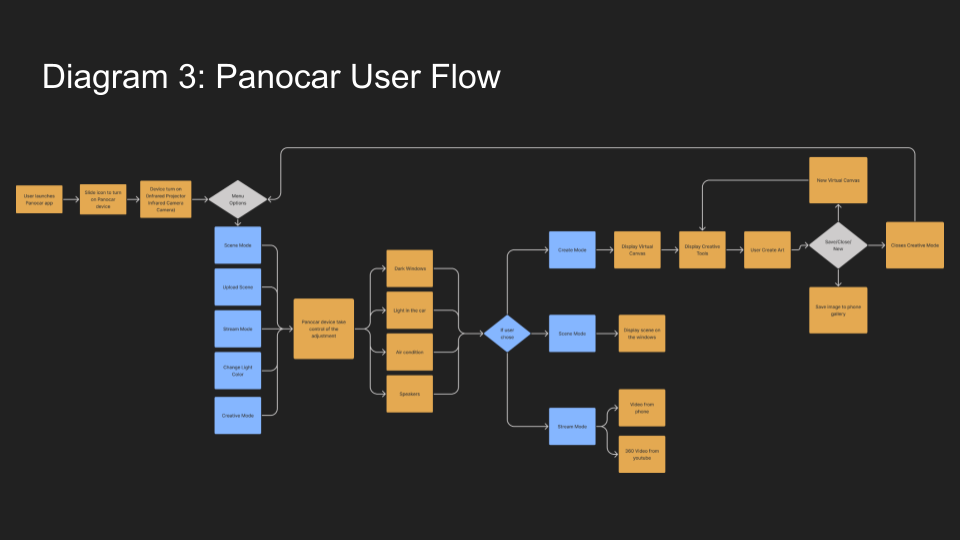
Micro-Interaction Flowcharts
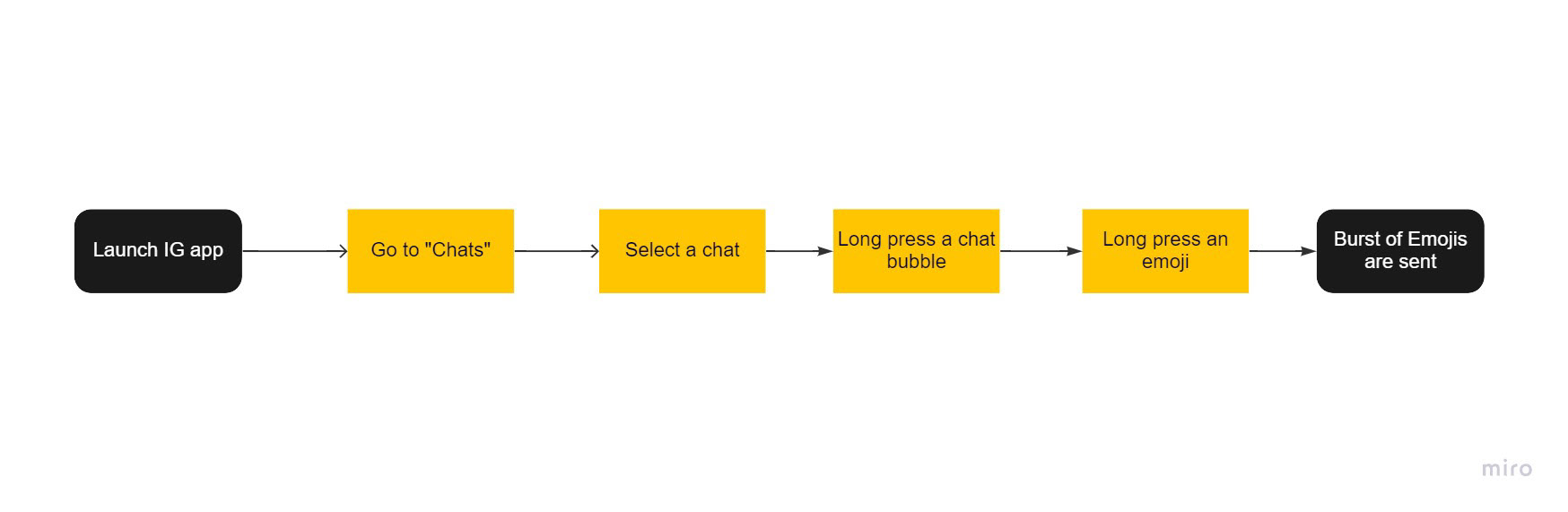
Instagram Direct Message Reactions
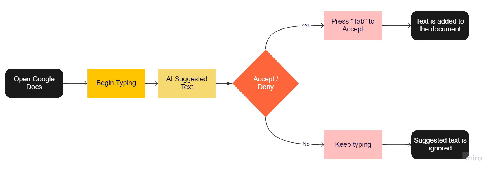
Google Docs Smart Compose
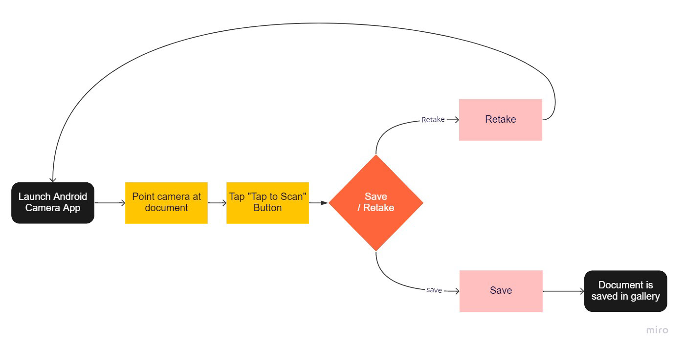
Android Document Scan
Feedback, Loops, Modes
Describe how feedback is used in the three microinteractions you had selected previously: effectively or not, skillfully or not, is it useful, is it appropriate, is it delightful?
The feedback for all my micro-interaction examples are appropriate, useful and delightful. For instance, in the case of Google's smart compose the feedback is the suggested text or phrase shown in a light font color thank the rest of typed text. The suggest text is shown at an appropriate time and the feedback informs the user that the text has not been added, instead it is simply a suggestion. The text does not stop the user from proceeding and informs the user on what to expect. The feedback is delightful because it is not overwhelming it is a nice surprise to see that the AI is learning phrases that your are using often without having to do nothing more than type content which the user is already doing. Instagrams DM reaction I find the most delightful because it is playful and fun. It feedback is timely and the user knows what the outcome will be. Android's Tap to Scan camera feedback is also delightful and appropriate. The feedback is clear, easy to see/discover and timely. I found it to be nice surprise when I discovered it. I was not looking for the feature, I discovered it while taking a photo of book cover. It was easy to discern what the capabilities of the feature and what the outcome would be. The feedback made me curious about the feature so I used it just to investigate its full capabilities.
A good example of a microinteraction that switches modes is the Instagram DM reactions, the mode changes depending on the reaction emoji that is selected and length the emoji is pressed. If the angry emoji is selected, there's an angry emoji that is sent. If the user uses a long press, then burst a burst of emojis is sent/seen.
Micro-interaction: Redesign

Reimagining Work

Occupation
Accounting Manager for a large business firm in Downtown Los Angeles. Has worked here for about 6 years. For 4 years they were an accountant and then 2 years ago they moved up to accounting manager. This was a pivotal moment for Anne; her financial security strengthened but with that hard deadlines became, well harder and the consequences for them got larger.
Darkest secrets
Anne has started to self medicate with MDMA and Psilocybin mushrooms. She refers to it as microdosing where she only takes a small enough dose so that she really doesn’t hallucinate or have any residual effects the day after. She also does it every other week on the last day of hybrid work day, during the end of day stand up meeting.
Biggest problems
They don’t have enough time and space to detach themselves from work and do something creative. Prior to having accounting take up their life, painting was something that helped Anne unwind and release tension. Sometimes she would do Paint and Sips on Friday nights with others at her local bar if she was feeling social. Or simply should wake up early on Sunday mornings and paint for a couple of hours just doing splatter art. This felt so soothing and helped reenergize her for the start of the week. Now work consumes her all the time.
What do they wish for
Anne wishes to reclaim her personal time or at least create a barrier from her work and creative time. She wants to use whatever time she has left to be creative and micro-dose in a safe environment. She wants to be her own person again. Since taking on her role as accounting manager she feels as if she has become her work. She no longer has any individuality.

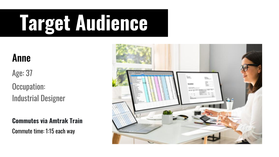
Occupation: Senior Industrial Designer
Dan has been working as an industrial designer for over twenty years. He was an apprentice in Italy back in the late 1990s where he designed sleek sofas for rich families. He then moved back to the United States in the early 2000s. Dan has seen many changes in the field of industrial design but he still stays on top of things and now finds himself working for a design firm in Pasadena.
Dan’s Quirks
Dan never leaves his house without 3 pencils and a sketchbook. The day he leaves the house without any of them, he feels as if he is walking around naked. It’s important for Dan to carry these items because if he gets an idea he wants to sketch it out so he doesn’t forget it.
Their biggest problems
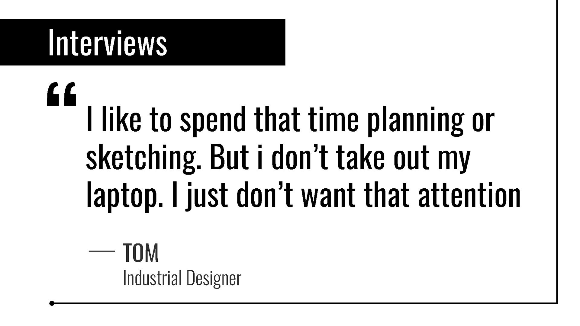
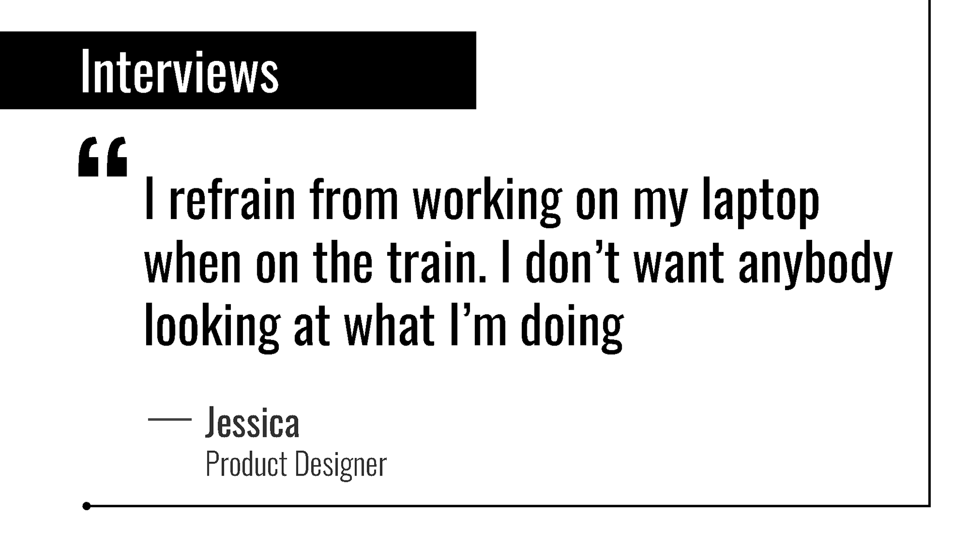
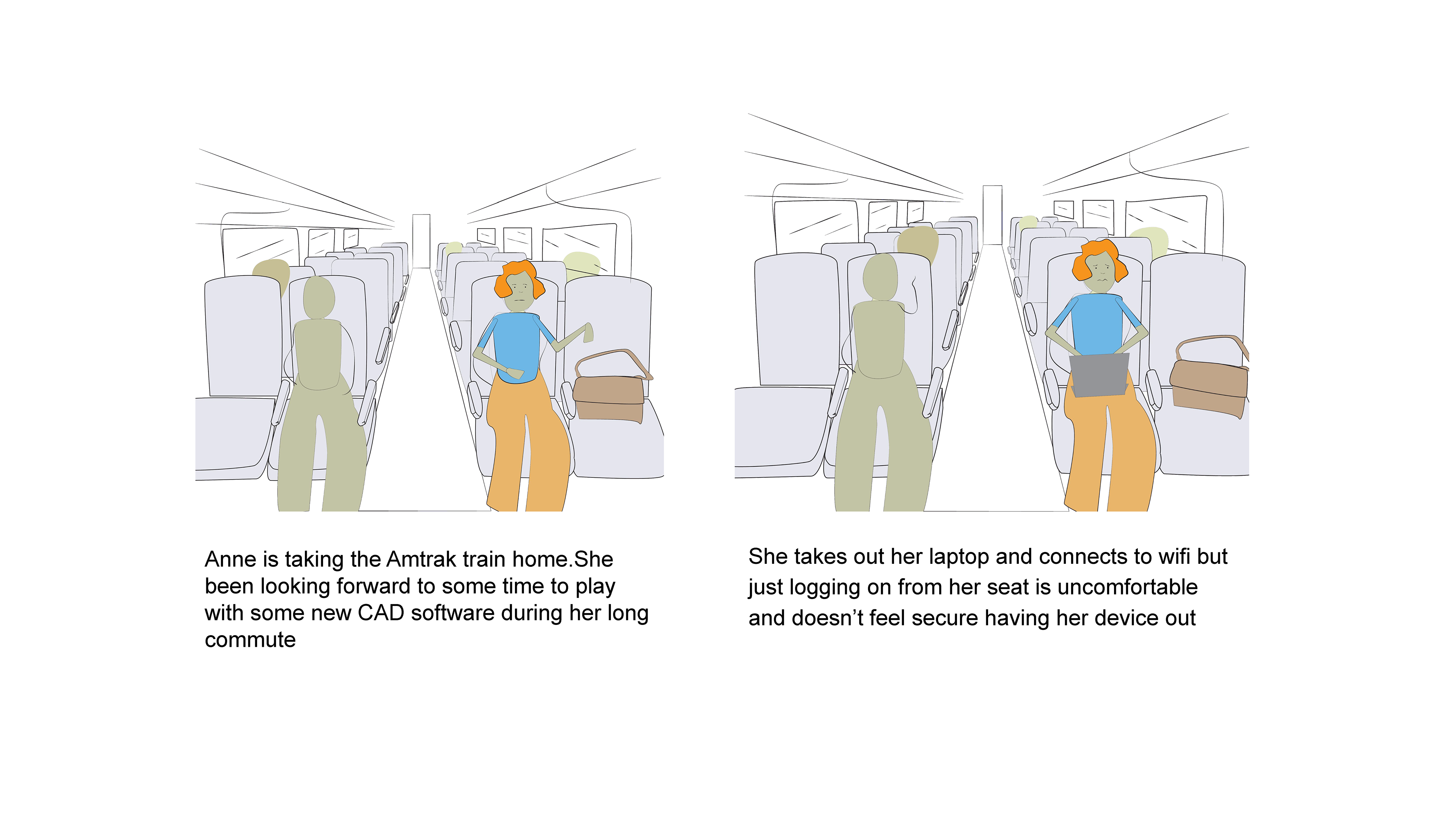
Dan has to return to the office as they have adopted a hybrid work plan. Dan’s commute is an hour and a half long and he wants to use his time to be more productive. He also wants to get some work done on his laptop or iPad.
What do they wish for
Dan wishes to make good use of his time while commuting to be productive and creative. He wants to listen to music to block out distractions.
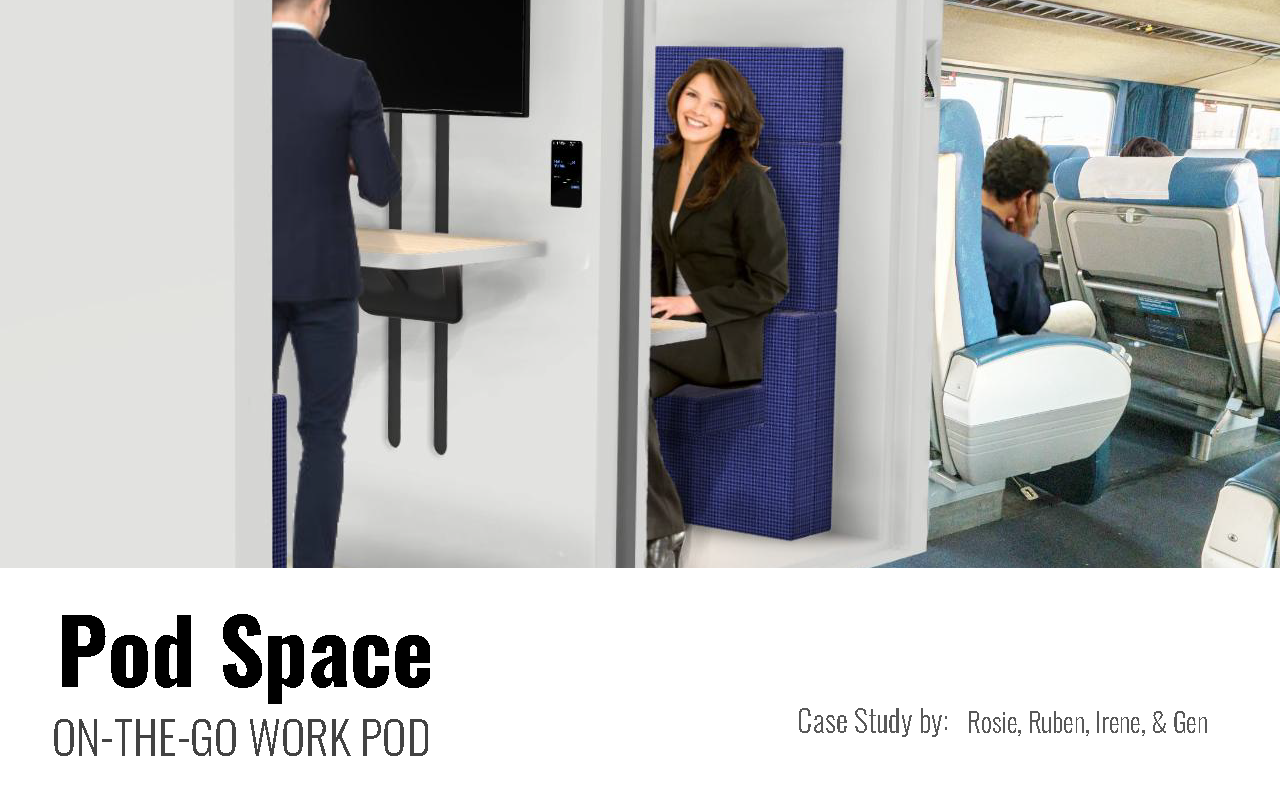
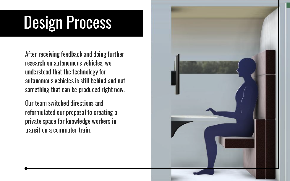
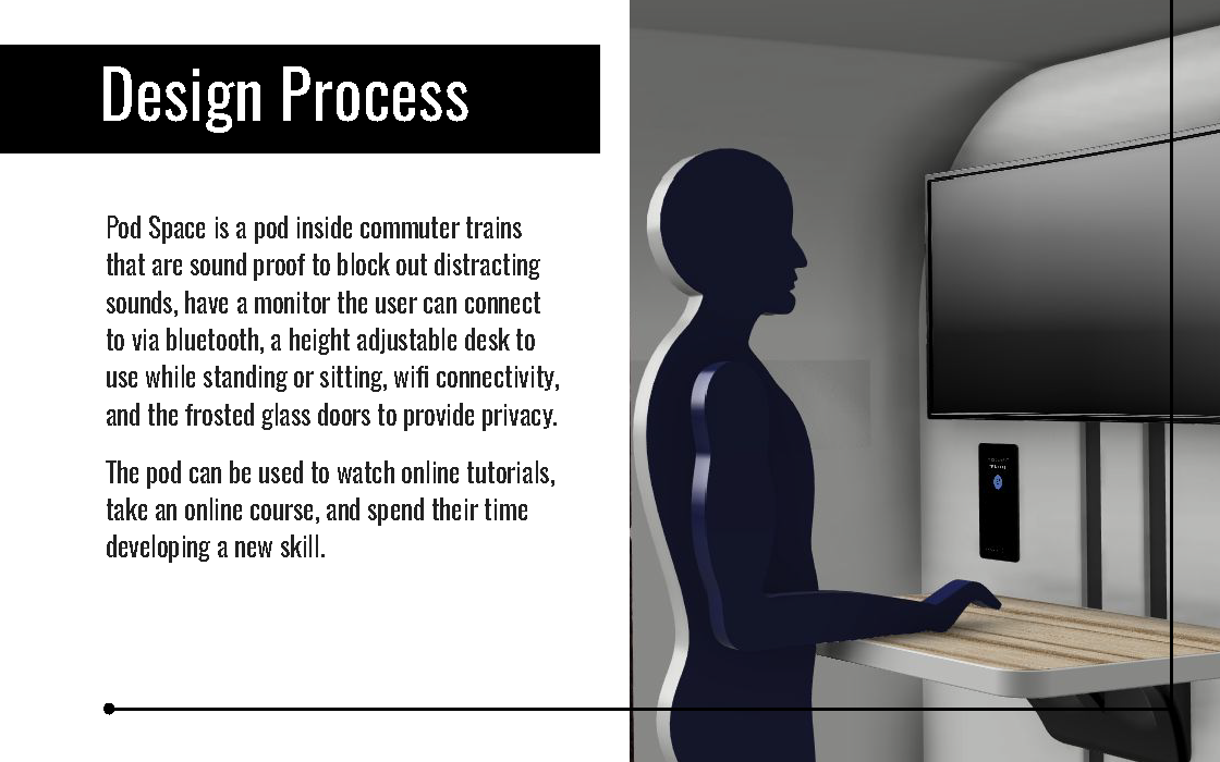
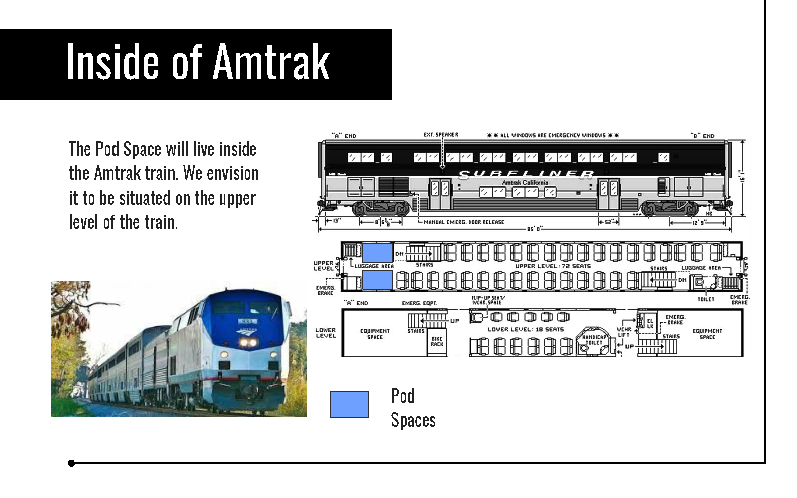
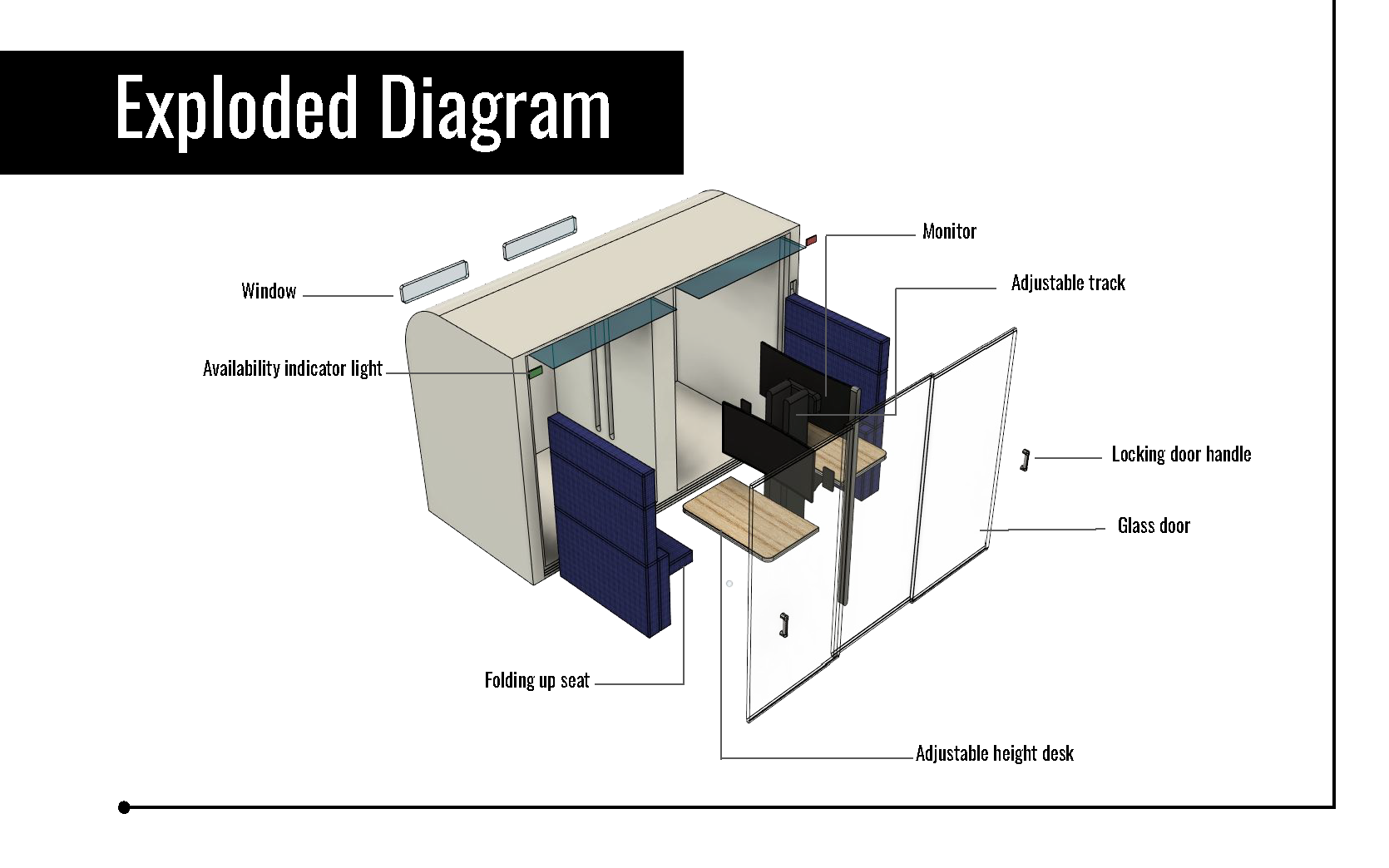
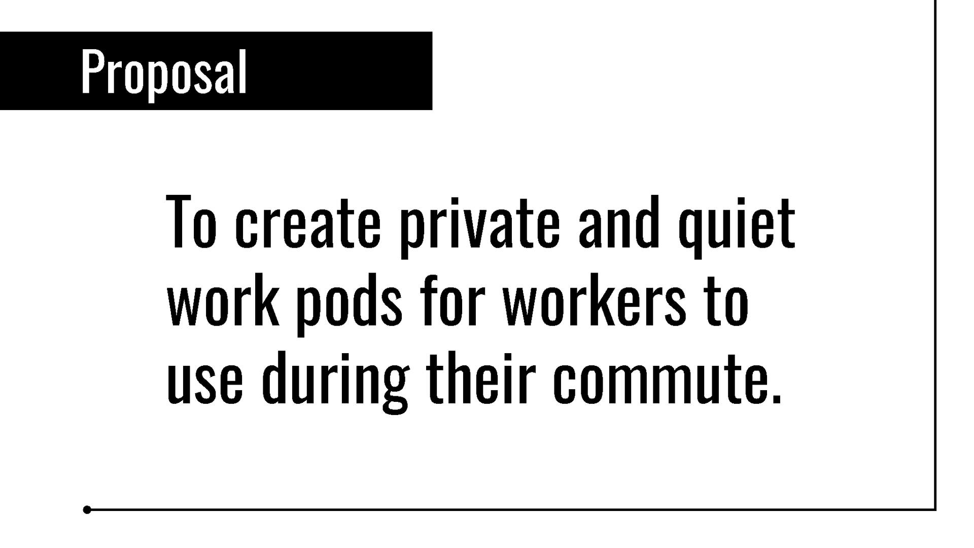
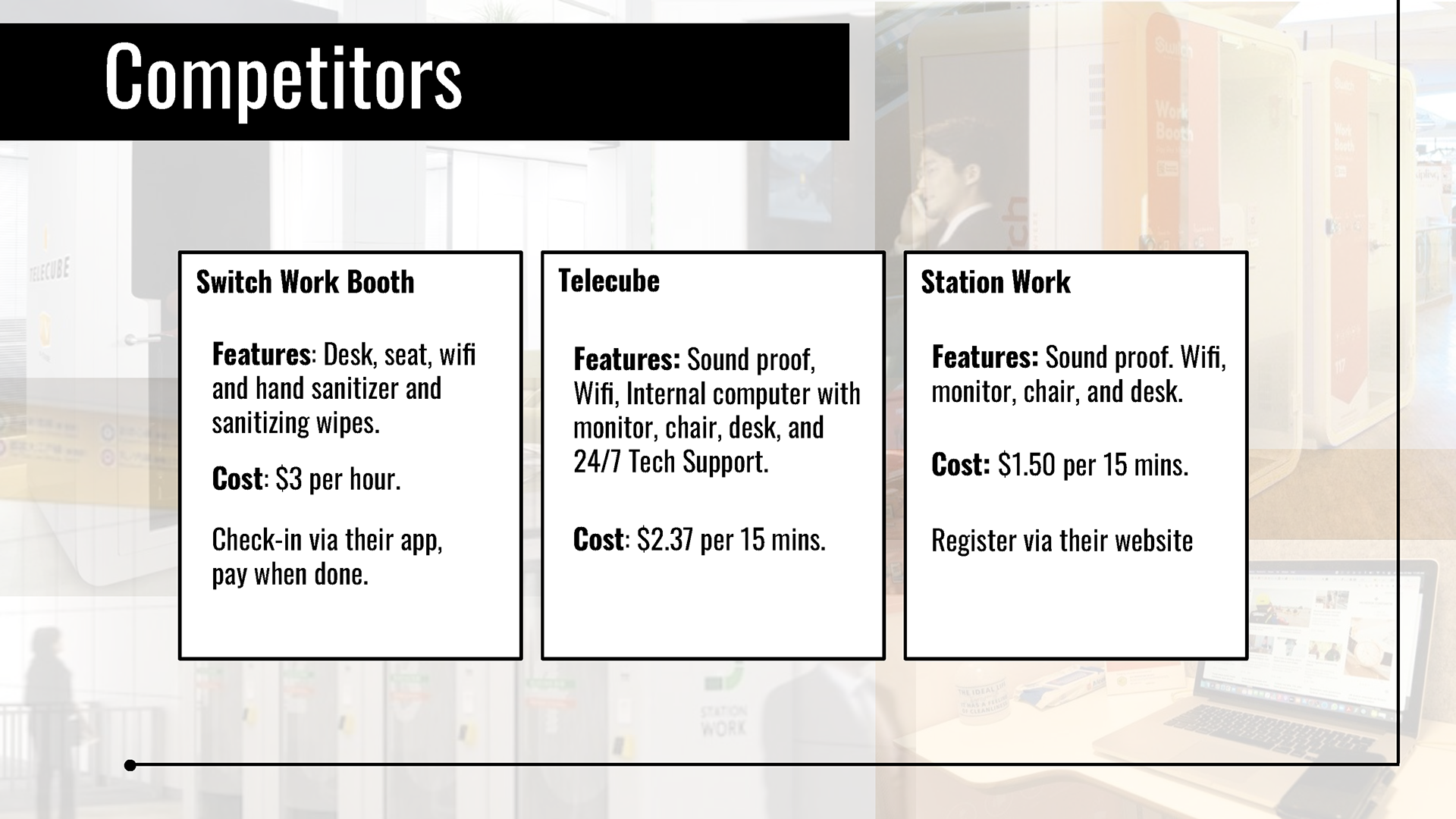
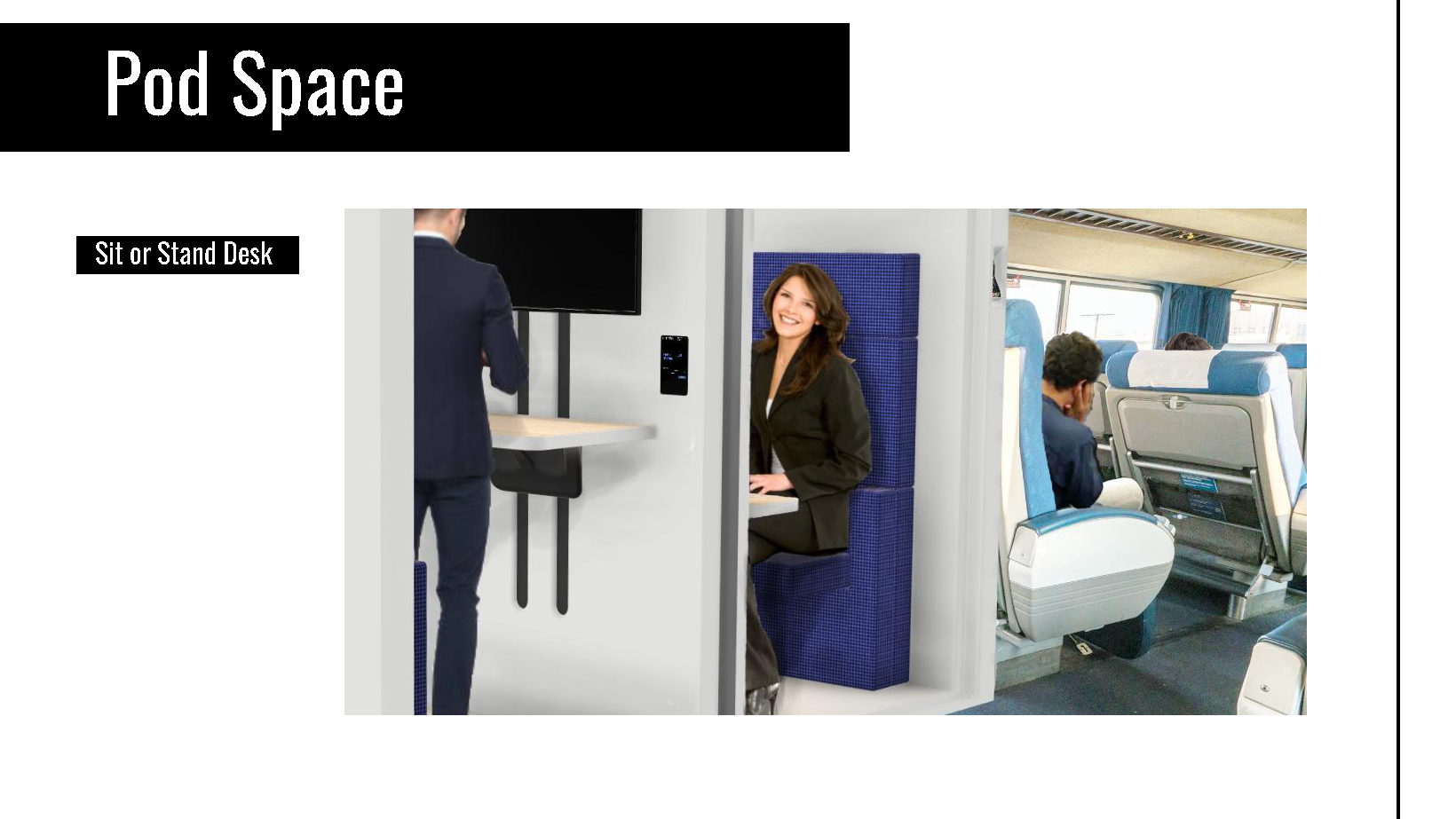
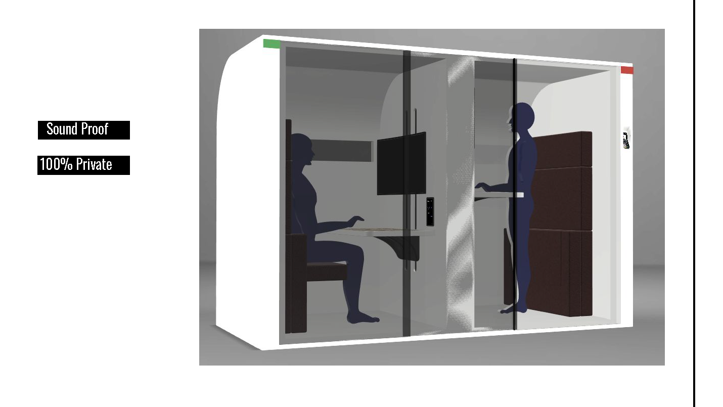
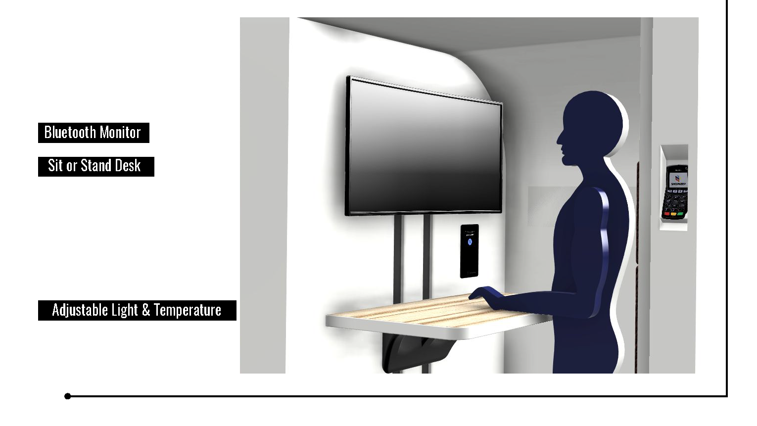
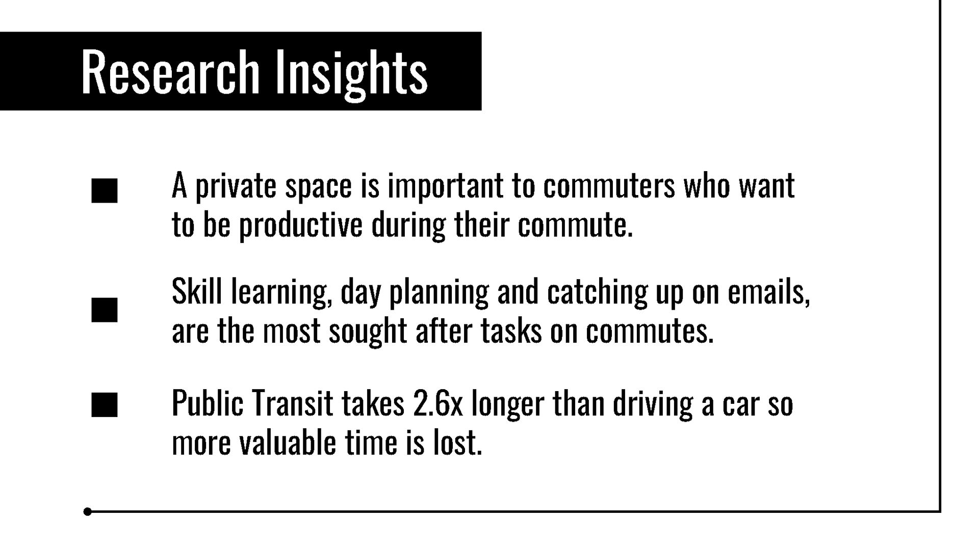
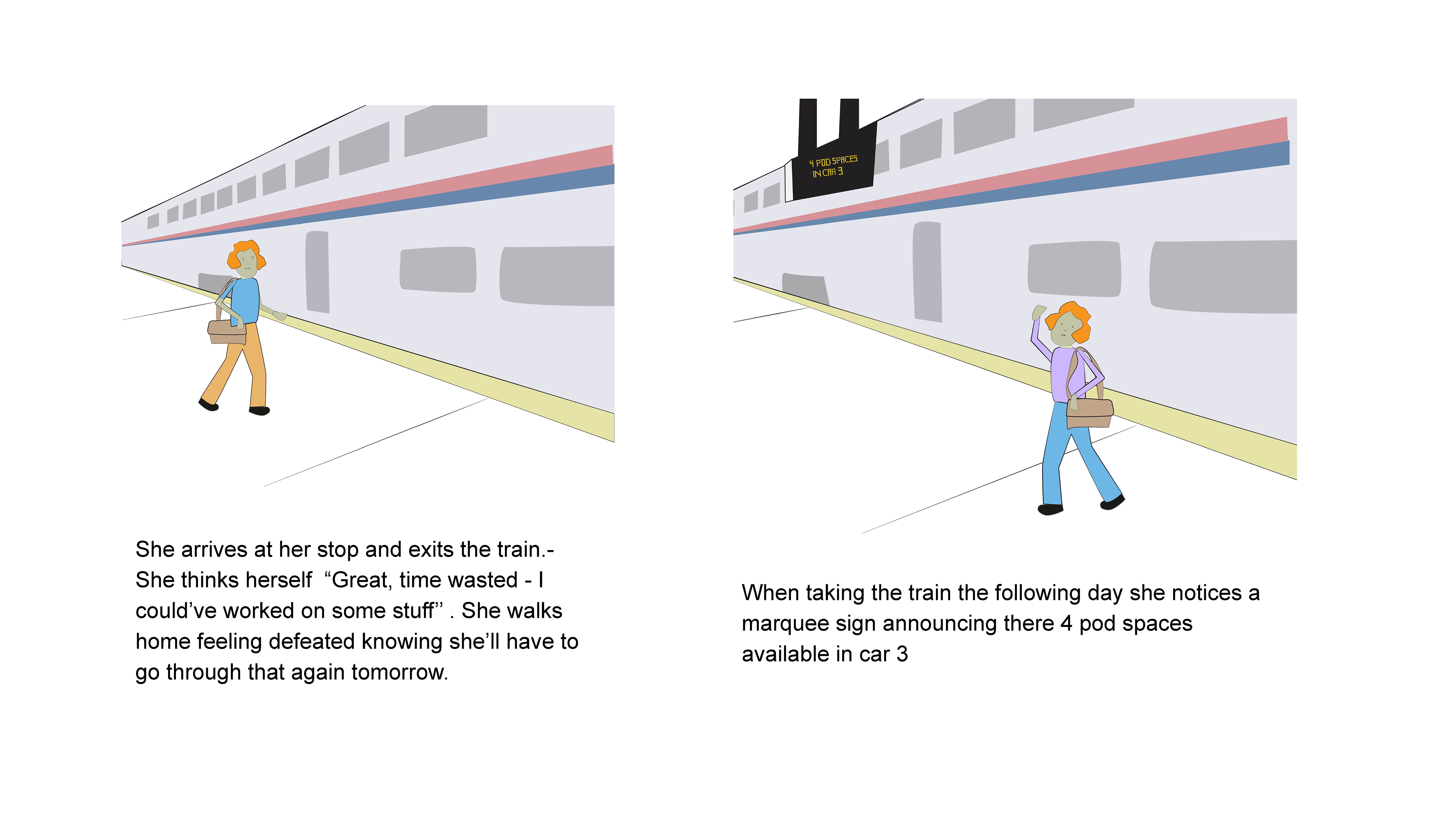
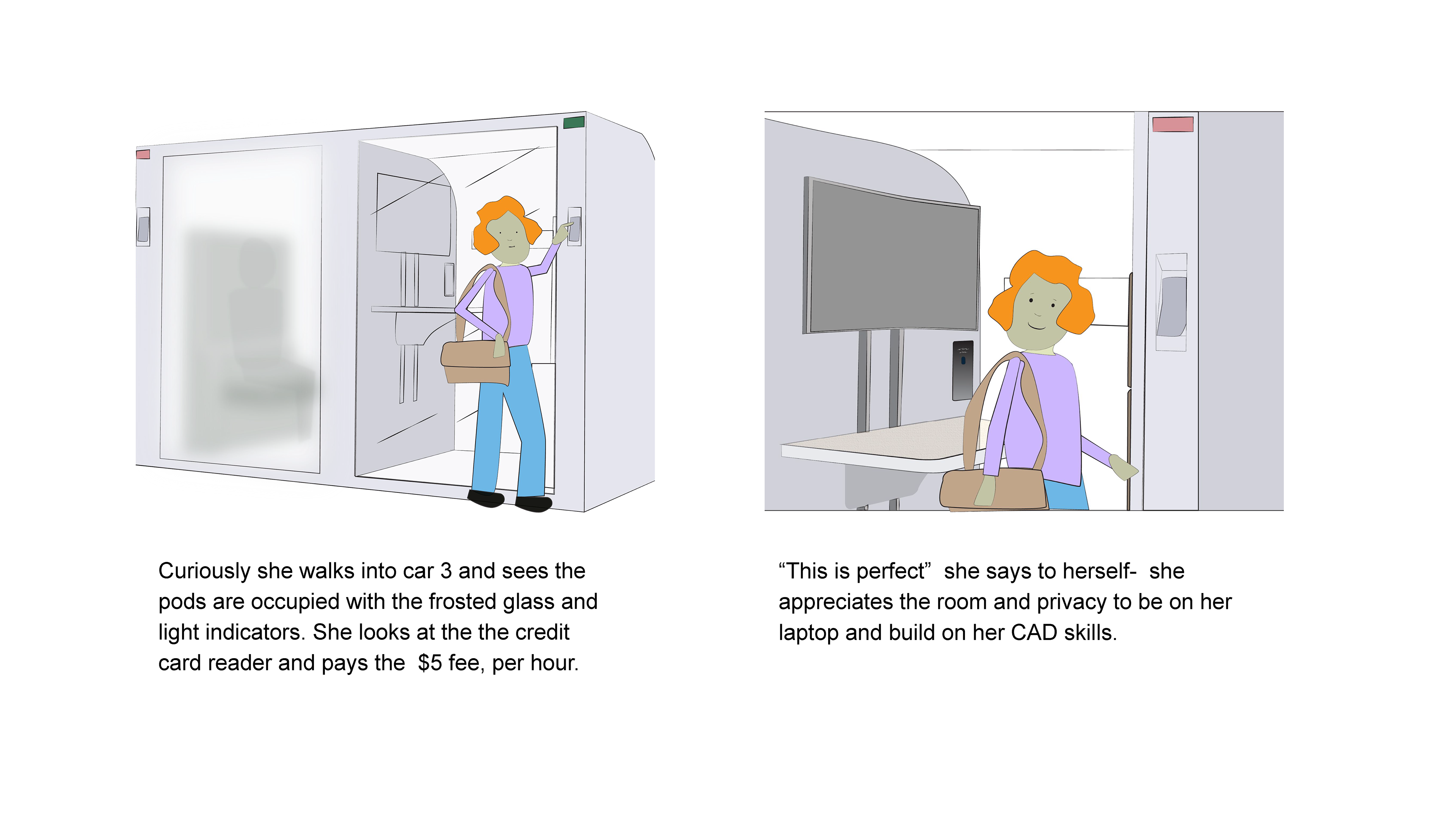
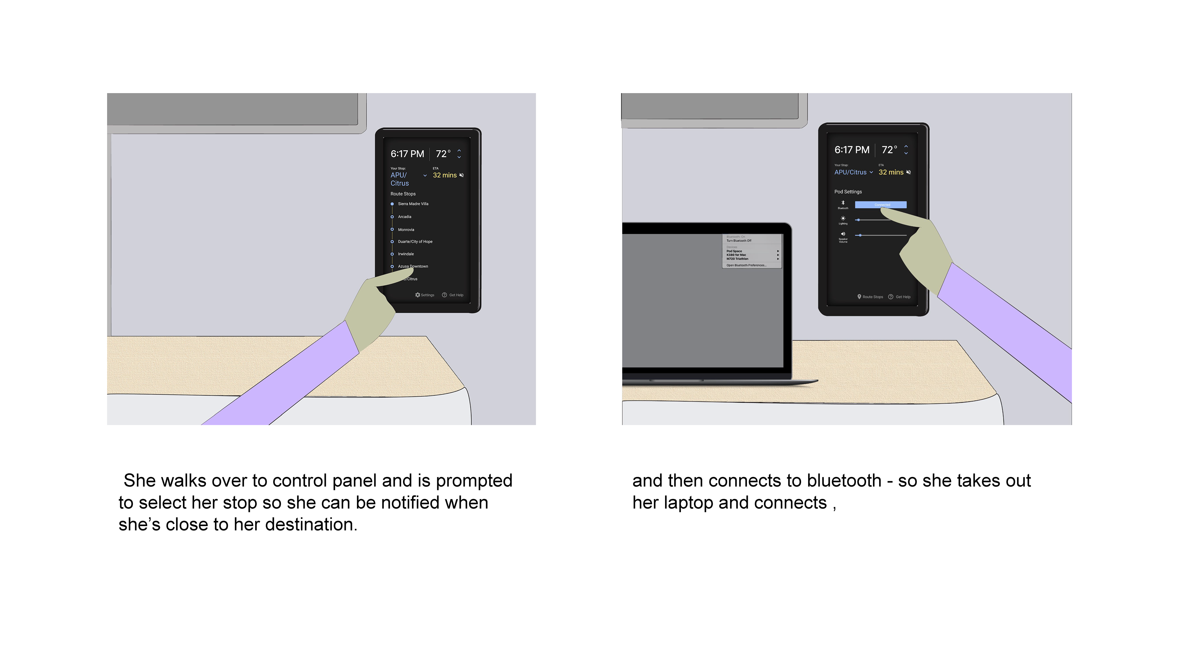
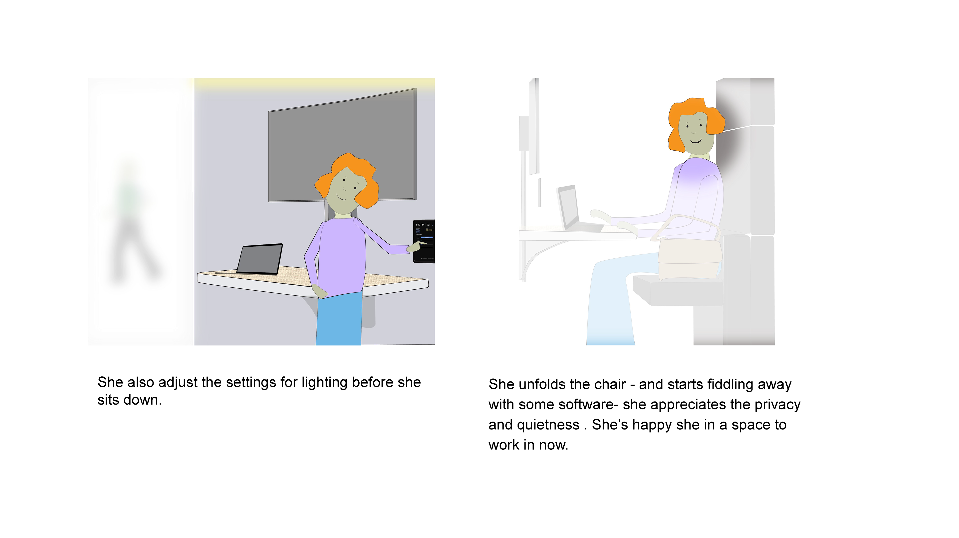
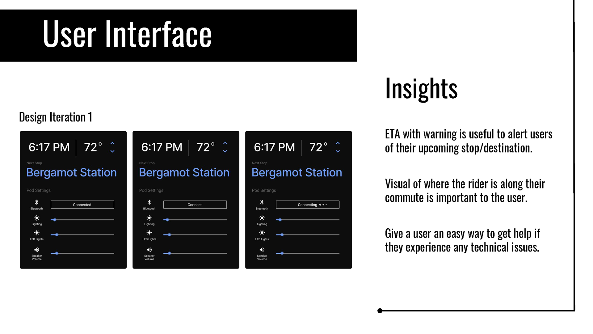
At this point of the project our team decided to pivot and change direction in our proposal. We decided to propose a work space/pod that would reside inside a commuter train. As a proof of concept, we decided to use Amtrak as our pilot commuter train.
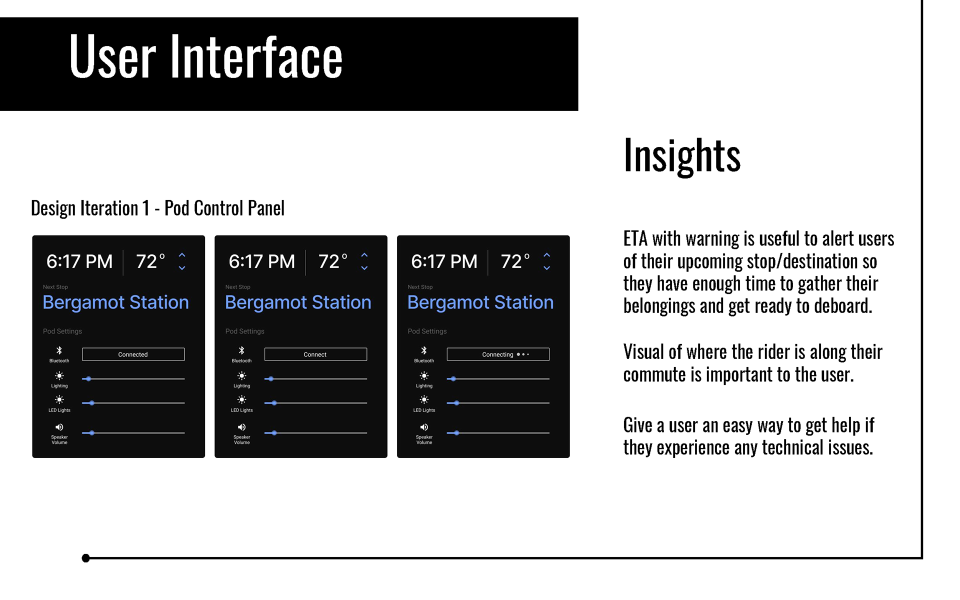
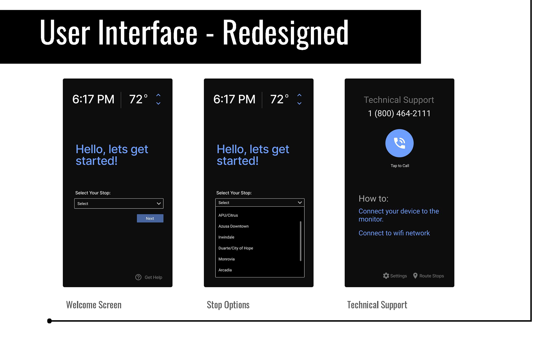
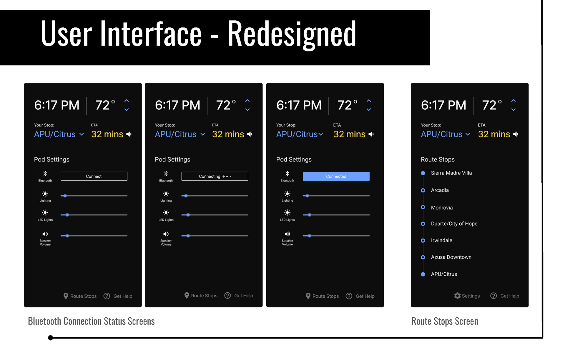
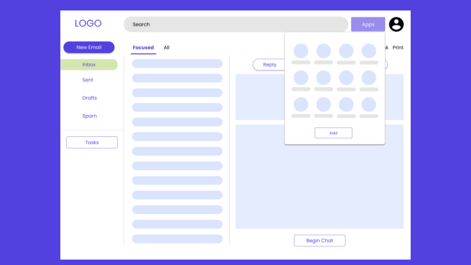
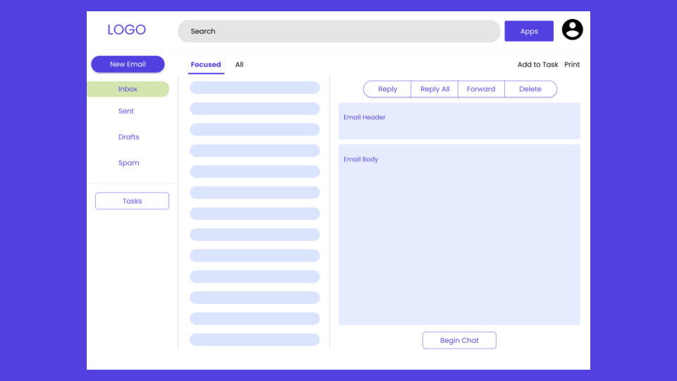
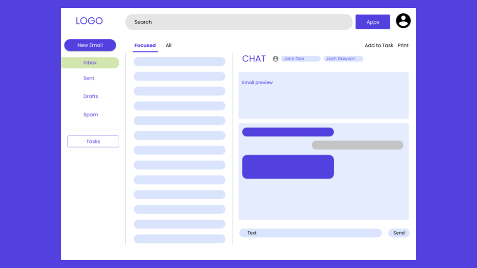
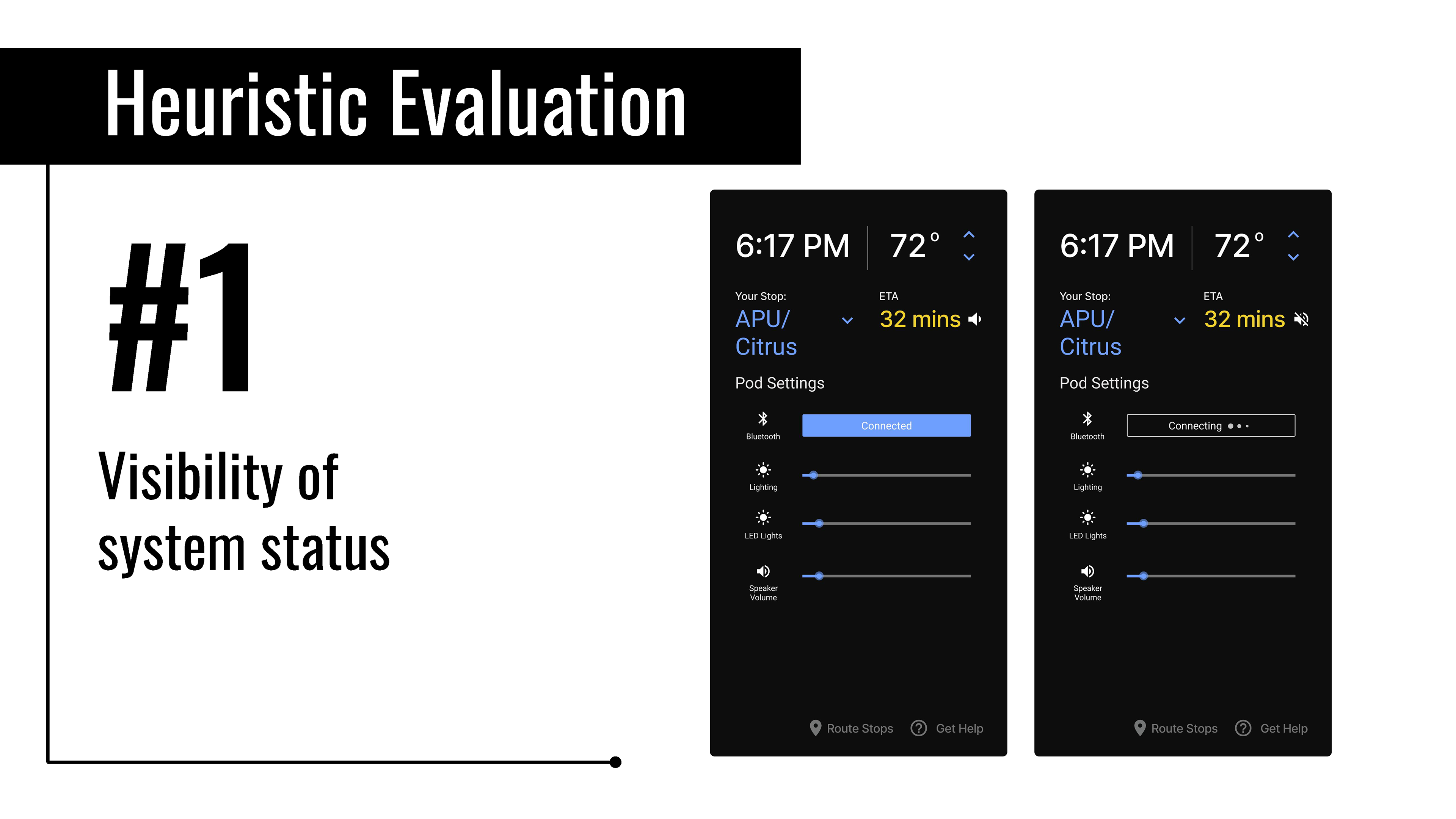
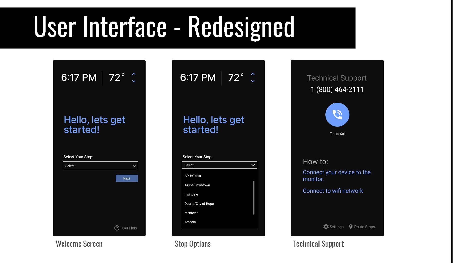
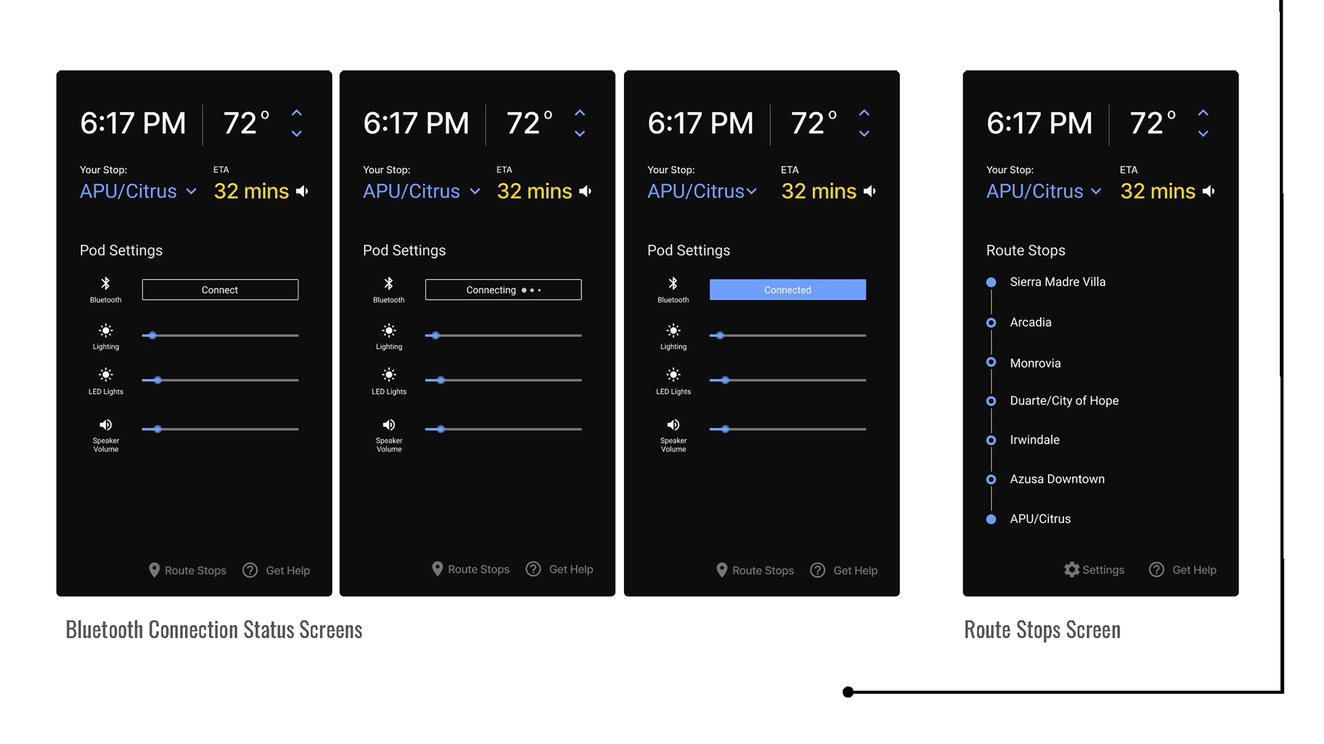
Pod Space UI
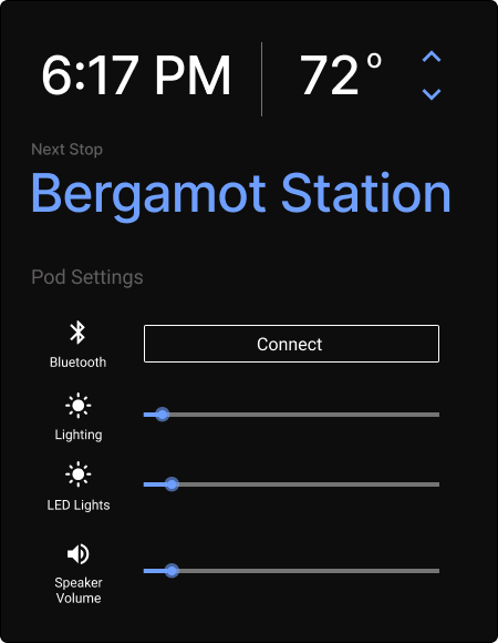
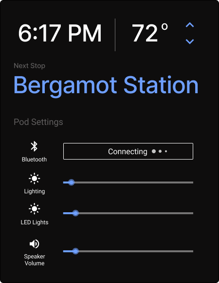
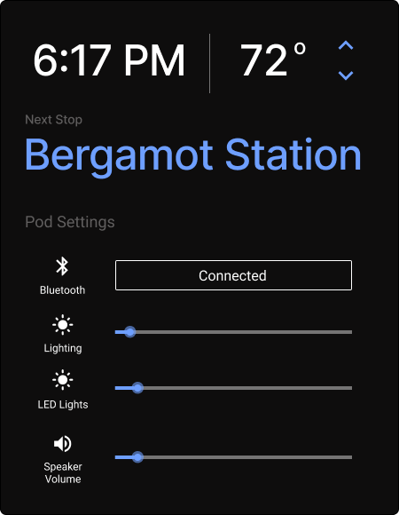
Hi-FI User Interface
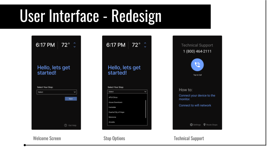
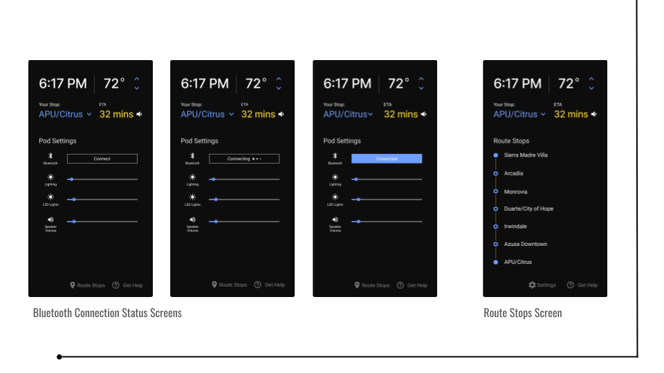
Pod Space Figma Prototype available at https://www.figma.com/file/WLn7FD0RaN46B2rtO4dnid/Pod-Space?node-id=0%3A1
Final Presentation


Pod Space Case Study